Feature #27050
closedmgr/dashboard: Landing Page Enhancements
100%
Description
Related to:
https://tracker.ceph.com/issues/24573
After the New Landing Page implementation,
we can add here all the suggested improvements to the landing Page
and we should discuss about the following:
- Implement "Data Health" card when this issue is completed:
https://tracker.ceph.com/issues/27049
- Suitability (or not) of having "PG Status" card in parallel with "Data Health",
showing (or not) info about PGs (is customer only interested in data, not PGs?).
- Layout changes:
- Move cards "Data Health / PG Status" to "Status" group (health)?
- Upgrade to Bootstrap 4?
- Define, if necessary, a color scheme for Landing Page charts (or whole dashboard?)
and implement a clean solution.
- Any other topic requiring attention.
Files
Updated by Alfonso Martínez over 5 years ago
- Related to Feature #24573: mgr/dashboard: Provide more "native" dashboard widgets to display live performance data added
Updated by Alfonso Martínez over 5 years ago
- Related to Feature #27049: mgr/dashboard: retrieve "Data Health" info from dashboard backend added
Updated by Alfonso Martínez over 5 years ago
- Related to Feature #27047: mgr/dashboard: Landing Page - Set visibility of cards depending on the user's role added
Updated by Volker Theile over 5 years ago
- File Auswahl_001.png Auswahl_001.png added
- File Auswahl_002.png Auswahl_002.png added
- File Auswahl_003.png Auswahl_003.png added
- The font size of the info-group should be set to 21px (regardless of the view size)
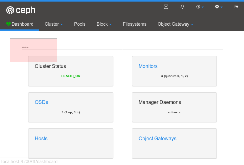 to fit into the look and feel of the rest of the UI, e.g.
- The font size of the info-card must have a max. size, otherwise it gets too big
Updated by Lenz Grimmer over 5 years ago
- Subject changed from mgr/dashboard: Landing Page Roadmap to mgr/dashboard: Landing Page Enhancements
- Category set to 132
- Target version set to v14.0.0
Updated by Alfonso Martínez over 5 years ago
- Related to Feature #27220: mgr/dashboard: Increase test coverage for components of New Landing Page added
Updated by Ju Lim over 5 years ago
- File mouse over and clickable values in dashboard card.png mouse over and clickable values in dashboard card.png added
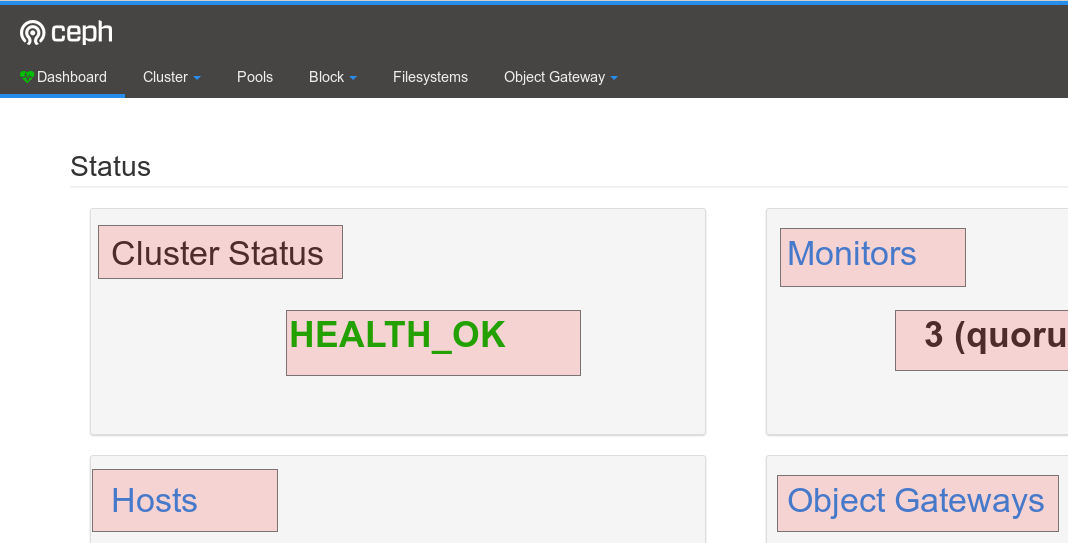
Some styling recommendations for the landing page -- see mockups in next comment.
- Change background color to gray (#F5F5F5)
- Change dropdown (menu) arrows to white (#FFFFFF)
- Change cards background to white (#FFFFFF)
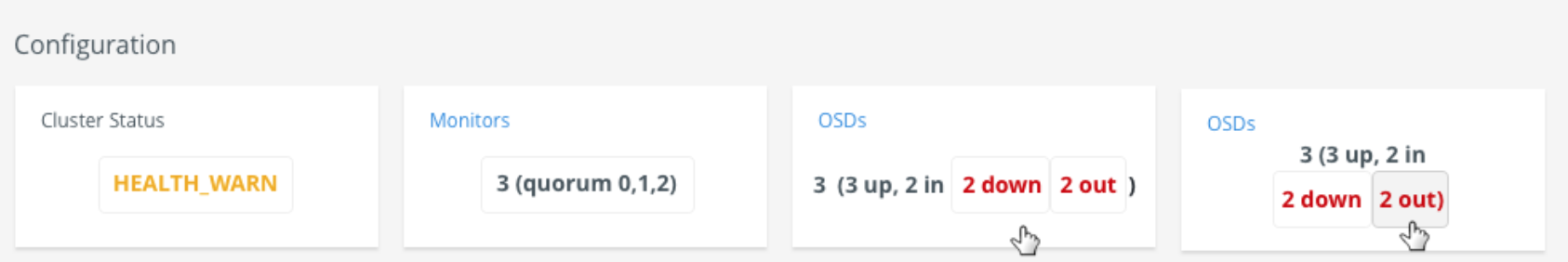
For any card with any mouse-over/hover treatment, can we show an always-present border (#EFEFEF) around each clickable value which then fills-in on hover:
- Hover border (#D1D1D1) -- see screenshot below
- Hover fill (#F3F3F3) -- see 2nd OSDs card example where the "2 out" is filled when user hovers over the value
For strings with multiple clickable areas, can we remove commas from between the values that are hyperlinked for better readability.
See screenshot example below:
Updated by Alfonso Martínez over 5 years ago
- Related to Feature #24571: mgr/dashboard: Move Cluster/Audit logs from front page to dedicated "Logs" page added
Updated by Ju Lim over 5 years ago
- File ceph_dash_1_border_nopunct.png ceph_dash_1_border_nopunct.png added
- File Screen Shot 2018-05-31 at 8.23.23 AM.png added
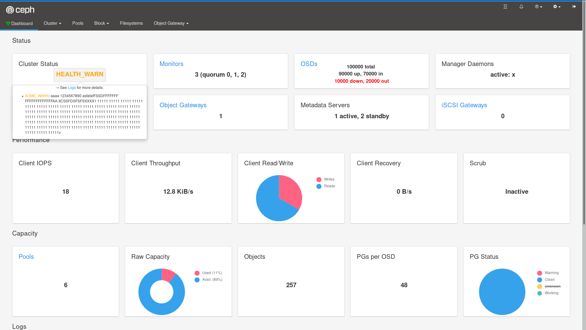
These are mockups for styling suggestions mentioned in my previous comment:
(1) Landing Page - overall styling - card and page background color changes example
(2) What would that same grey look like in a different page of Ceph Dashboard
Updated by Ju Lim over 5 years ago
- File deleted (
Screen Shot 2018-05-31 at 8.23.23 AM.png)
Updated by Ju Lim over 5 years ago
- File Other Page View.png Other Page View.png added
Updated by Ju Lim over 5 years ago
There's another Ceph tracker that was created with similar styling recommendations but for some reason we didn't go back update this one. See https://tracker.ceph.com/issues/35691.
Updated by Ju Lim over 5 years ago
- Related to Cleanup #35691: mgr/dashboard: Proposed Landing Page added
Updated by Ju Lim over 5 years ago
- Related to Cleanup #35691: mgr/dashboard: Proposed Landing Page added
Updated by Ju Lim over 5 years ago
- Related to deleted (Cleanup #35691: mgr/dashboard: Proposed Landing Page)
Updated by Patrick Seidensal over 5 years ago
Ju Lim wrote:
Some styling recommendations for the landing page -- see mockups in next comment.
- Change background color to gray (#F5F5F5)
- Change dropdown (menu) arrows to white (#FFFFFF)
- Change cards background to white (#FFFFFF)For any card with any mouse-over/hover treatment, can we show an always-present border (#EFEFEF) around each clickable value which then fills-in on hover:
- Hover border (#D1D1D1) -- see screenshot below
- Hover fill (#F3F3F3) -- see 2nd OSDs card example where the "2 out" is filled when user hovers over the valueFor strings with multiple clickable areas, can we remove commas from between the values that are hyperlinked for better readability.
See screenshot example below:
We talked about this proposal internally and nobody raised any concerns or objections. We like it.
Updated by Kai Wagner over 5 years ago
LGTM - Go ahead and we could add the little usability enhancements later on
Updated by Kai Wagner over 5 years ago
As discussed today I have two suggestions:
1.) The general font size of the widgets is to big from my perspective and completely different to the rest of the menu for example.
2.) I'm not able to zoom-in or zoom-out at the moment. If I do so only the menu font will be decreased or increased. Would love to have the possibility to change the widget + font size by zooming as well.
Thanks,
Kai
Updated by Alfonso Martínez over 5 years ago
Updated by Alfonso Martínez over 5 years ago

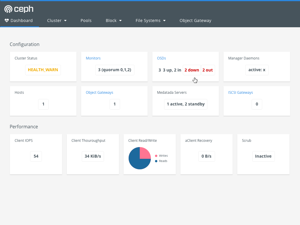
Milestone 2
Work done:
- Changed background color to gray.
- Changed cards' background color to white.
- Changed navigation menu dropdown arrows' color to white.
- Changed card font size to fluid: from 12px to 21px
for screen range: 320px -- 2048px (2K) (fixes: zoom in/out).
- Info Group Title: fixed font size: 21px. Removed underline.
- OSD card: info breakdown in 2/3 lines for huge OSDs amount.
- Cluster Status card: added style for clickable element
with mouse hover behaviour.
- All cards (except logs) viewable (at-a-glance) without scrolling in 1920x1080 (Full HD) presentation mode.
- Improved perf./capacity cards layout for 1366x768 (HD resolution).
Updated by Lenz Grimmer over 5 years ago
- Status changed from New to Fix Under Review
Updated by Ricardo Marques over 5 years ago
- Status changed from Fix Under Review to Resolved
Updated by Ernesto Puerta about 3 years ago
- Project changed from mgr to Dashboard
- Category changed from 132 to General