Feature #24573
closedmgr/dashboard: Provide more "native" dashboard widgets to display live performance data
100%
Description
While we plan to Embed Grafana Dashboards for displaying more detailed performance data and history, the Ceph Manager Dashboard itself should provide a minimal set of widgets/gauges to display at least the current key performance characteristics without requiring the installation and integration of any external monitoring tools.
Currently, the dashboard shows live status updates for the following information:
- Overall health status
- MON/OSD/MDS/MGR status (up, down, active, etc)
- Usage (Objects, raw capacity, usage by pool)
In addition to that, I suggest to add native widgets to display the following information:
- Total I/O (reads/writes)
- Total IOPs (read/write)
- PG status (active / clean / degraded, etc.)
See other tools like Inkscope, Calamari or Croit for some inspiration:
https://github.com/inkscope/inkscope/tree/master/screenshots
https://github.com/ceph/calamari-clients/tree/master/screenshots
https://croit.io/screenshots
Files
Updated by Lenz Grimmer almost 6 years ago
- Tags set to dashboard
- Affected Versions v13.2.0 added
Updated by Lenz Grimmer almost 6 years ago
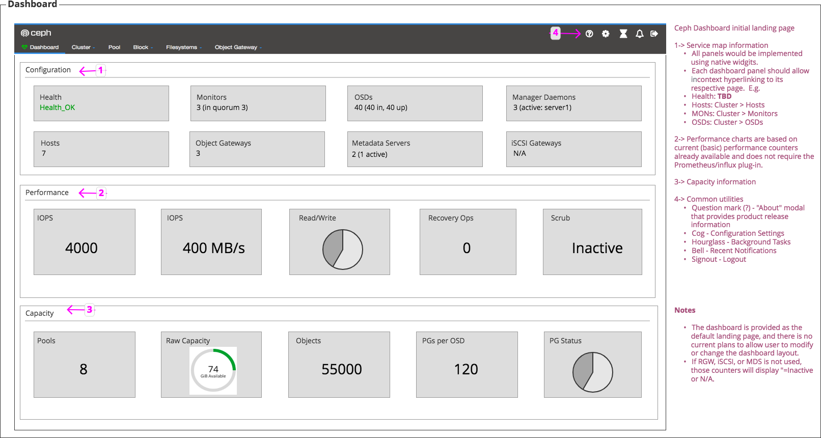
Some additional aspects:
- Provide configuration, performance information and usage
- Information at-a-glance using native widgets
- Each dashboard panel would be allow in-context hyperlinking to its respective pages (e.g. the "OSDs" widget would link to the OSD page, etc.)
- No ability to show/hide, drag/reorder dashboard panels (change layout) would be provided
Updated by Ju Lim almost 6 years ago
Attached is the proposal for the Ceph Dashboard landing page (main dashboard).
Updated by Kanika Murarka almost 6 years ago
- Assignee changed from Kanika Murarka to Alfonso Martínez
Updated by Alfonso Martínez almost 6 years ago
Updated by Ricardo Marques almost 6 years ago
- Description updated (diff)

Updated by Ricardo Marques almost 6 years ago
Some notes regarding the proposal v2:
- Using a "Doughnut Chart" for "Read/Write" does not seem appropriate, what about a "Line Chart" here?
- "Monitors", "OSDs", etc... should be a link to the corresponding dedicated page
- You have 2 cards with the same title "IOPS", is this intentional?
Updated by Lenz Grimmer almost 6 years ago
Ricardo Marques wrote:
- Using a "Doughnut Chart" for "Read/Write" does not seem appropriate, what about a "Line Chart" here?
I concur. We agreed to keep the current widget for the initial PR and then replace widgets with more appropriate types in a separate PR.
- "Monitors", "OSDs", etc... should be a link to the corresponding dedicated page
Ack.
I like this design, but I was wondering if it would make sense to align the content of the "Configuration" cards to the center of the card as well?
Updated by Lenz Grimmer almost 6 years ago
Lenz Grimmer wrote:
Ricardo Marques wrote:
- Using a "Doughnut Chart" for "Read/Write" does not seem appropriate, what about a "Line Chart" here?
I concur. We agreed to keep the current widget for the initial PR and then replace widgets with more appropriate types in a separate PR.
Actually, since this is a new widget, it probably makese sense to start using a more approriate chart type here from the beginning. I'd suggest to go with the same chart type that is used on the OSD and MON pages.
Updated by Alfonso Martínez almost 6 years ago
Ricardo Marques wrote:
Some notes regarding the proposal v2:
- Using a "Doughnut Chart" for "Read/Write" does not seem appropriate, what about a "Line Chart" here?
- "Monitors", "OSDs", etc... should be a link to the corresponding dedicated page
- You have 2 cards with the same title "IOPS", is this intentional?
- You have 2 cards with the same title "IOPS", is this intentional?
No, in fact 2nd card with IOPS showing 400 MB/s should say “Throughput”.
- "Monitors", "OSDs", etc... should be a link to the corresponding dedicated page
Yes, the link applied to the title or the whole card (clicking at any point in the card)?
- Using a "Doughnut Chart" for "Read/Write" does not seem appropriate, what about a "Line Chart" here?
Yes, chart types are to be determined. In the proposal, charts were placeholders only.
Updated by Alfonso Martínez almost 6 years ago
Lenz Grimmer wrote:
I like this design, but I was wondering if it would make sense to align the content of the "Configuration" cards to the center of the card as well?
As long as there is consensus, it is a good option for me.
Updated by Ricardo Marques almost 6 years ago
Yes, the link applied to the title or the whole card (clicking at any point in the card)?
IMO, link in the title is more flexible because will allow you to have other links inside the card.
Updated by Alfonso Martínez almost 6 years ago
According to our conversation in IRC channel #ceph-dashboard between me, Lenz and Josh Collin:
On bottom of landing page we will keep "Logs" info until feature #24571 is completed.
Updated by Ju Lim almost 6 years ago
+1 on using a line chart for the Read/Write card. In the initial proposal, I tried to go with the pie chart that we had (single point in time) from Cephmetrics, but agree the line chart makes more sense especially since we have multiple data points we can show).
Regarding the link on the "Monitors", "OSDs", etc., +1 to having the link applied to the title (vs. the whole card) especially if in the future we enable other drill downs (or hyperlinks) on specific elements within the card. There should be some kind of visual treatment for the user to know that the title is hyperlinkable, i.e. currently, we are using blue text to indicate the hyperlink.
+1 on 'align the content of the "Configuration" cards to the center of the card as well'. In the initial proposal, I had tried to stay as close to the initial dashboard landing page, but agree it makes more sense for alignment to be centered to be consistent with the other cards on the landing page.
I noted that the Logs will remain on bottom of landing page until feature #24571 is completed.
Updated by Alfonso Martínez over 5 years ago
About the suggestion of having a line chart for "Read/Write" Card, we need "Pool Stats" history or time series.
After reaching out John Spray about retrieving this info, I've got the following response:
"Ceph generally has two kinds of statistic: performance counters (all
services have these, and they're gathered centrally in ceph-mgr), and
statistics that are part of the cluster maps (things like osdmap,
pgmap, which are stored on the mon, and mgr has a copy). ceph-mgr
keeps the short time history for the performance counters, but not for
the stats we're reading from cluster maps.
This disparity is because keeping the history of performance counters
is very simple to implement (all perf counters are updated at regular
time intervals, and make sense as time series), whereas cluster maps
contain all kinds of things, which don't all make sense as time
series, and cluster maps don't necessarily update at regular
intervals."
So, after a conversation with Ricardo Marques, we'll go with a Pie Chart
until we set a strategy to store this kind of information.
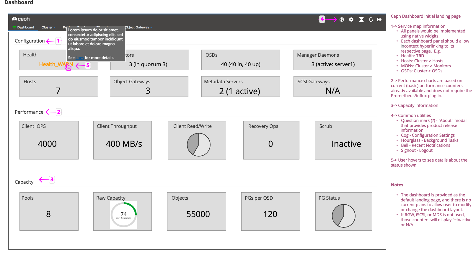
Updated by Alfonso Martínez over 5 years ago
- File proposal-latest.png proposal-latest.png added

Updated by Patrick Seidensal over 5 years ago
I like the legends very much, but it might be even better if they were on their own columns, so that there'd be more space for the graphs left and they could be rendered a little bit bigger (they've become quite small due to the addition of the legends).
Updated by Ju Lim over 5 years ago
- File Landing Page.png Landing Page.png added
Some suggestions:
- Can we make the card title a little bigger (maybe 1 font size bigger)?
- It would be nice to add some color styling to some of the configuration cards, e.g. when OSDs are down?
- Can we make the text a bit bigger for the values on the configuration cards (to look closer in size with the other cards)?
- Do we want the metrics' units to align with the CLI? E.g. KiB/s vs. KB/s , MiB vs. MB, etc. Rest of the UI is using KiB, MiB, etc. but the CLI shows KB, MB, etc.
- For the Health card, let's have a tooltip with hyperlink when we move the logs. E.g. at the end of the tooltip text "See [[Logs]] for details."
- Can we remove the "i" icon on the Health card (for the tooltip)?
- Can we try to make outer box of config, performance, capacity and logs without lines (white line) so it’s not visible?
- Add legends to the bottom left or bottom right of the charts (vs. on top of the chart)
I've added a mockup example below.
Updated by Alfonso Martínez over 5 years ago
Updated by Alfonso Martínez over 5 years ago
Updates on the following:
Patrick: I like the legends very much, but it might be even better if they were on their own columns, so that there'd be more space for the graphs left and they could be rendered a little bit bigger (they've become quite small due to the addition of the legends).
Ju Lim: - Add legends to the bottom left or bottom right of the charts (vs. on top of the chart)
Done.
- Can we make the card title a little bigger (maybe 1 font size bigger)?
Done.
- It would be nice to add some color styling to some of the configuration cards, e.g. when OSDs are down?
Done.
- Can we make the text a bit bigger for the values on the configuration cards (to look closer in size with the other cards)?
Done.
- Do we want the metrics' units to align with the CLI? E.g. KiB/s vs. KB/s , MiB vs. MB, etc. Rest of the UI is using KiB, MiB, etc. but the CLI shows KB, MB, etc.
Tiago Melo feedback: this belongs to a new issue/PR.
- For the Health card, let's have a tooltip with hyperlink when we move the logs. E.g. at the end of the tooltip text "See [[Logs]] for details."
This will be implemented once the related issue is resolved.
- Can we remove the "i" icon on the Health card (for the tooltip)?
Done. The tooltip now belongs to the health message and it appears on the right.
- Can we try to make outer box of config, performance, capacity and logs without lines (white line) so it’s not visible?
Done.
Updated by Tiago Melo over 5 years ago
- the tooltip should not break the error messages if there is space left on the screen
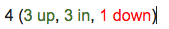
- OSDs info should only be red if there are OSDs down
- Since we are using labels on the other charts, PG Status should also have it.
- Since you are using a tooltip over the text, the text should be a hyperlink. otherwise you will not be able to click on the link inside the tooltip.
Updated by Paul Cuzner over 5 years ago
Nit-picking - but could we opt for different colors to make the charts stand out a little more.
Updated by Ricardo Marques over 5 years ago
- Status changed from New to In Progress
Updated by Alfonso Martínez over 5 years ago
Updated by Alfonso Martínez over 5 years ago
Updates following the feedback from Dashboard Daily standup & Sync:
- Changed tooltip in favor of popover (with the same width aprox. as info card).
This popover shows a link to "Logs" area. - CSS changes in order to have the same style as in other Dashboard areas
(rounded corners, background colors, ...) - "PG Status" chart legend: it is agreed
for nownot to be shown beacause of label texts being too long. - Color palette and other visual fine-tuning will be discussed/implemented in future PR.
Updated by Ju Lim over 5 years ago
First-off, I want to say thank you for making progress on the landing page. It’s starting to take shape and is looking better every time I see the changes made.
And now some comments:- The grey color and edges of the cards changes seem to now be consistent with other parts of Ceph Dashboard now.
- Heath card: Popover looks good. We still need a way for user to know that this is something the user can mouse-over.
- For the Configuration cards (Monitors, OSDs, Manager Daemons, Metadata Servers), color styling the text would be helpful especially when something is down or in a degraded/warning state. I know you mentioned it’s done previously, but do you have an updated example to show when the OSD is down?
- Raw capacity card: I know in the original landing page, it had a donut showing the utilization, and now we’re showing a gauge. The gauge seems an unusual choice. Is it possible to go back to the donut or consider a different layout?
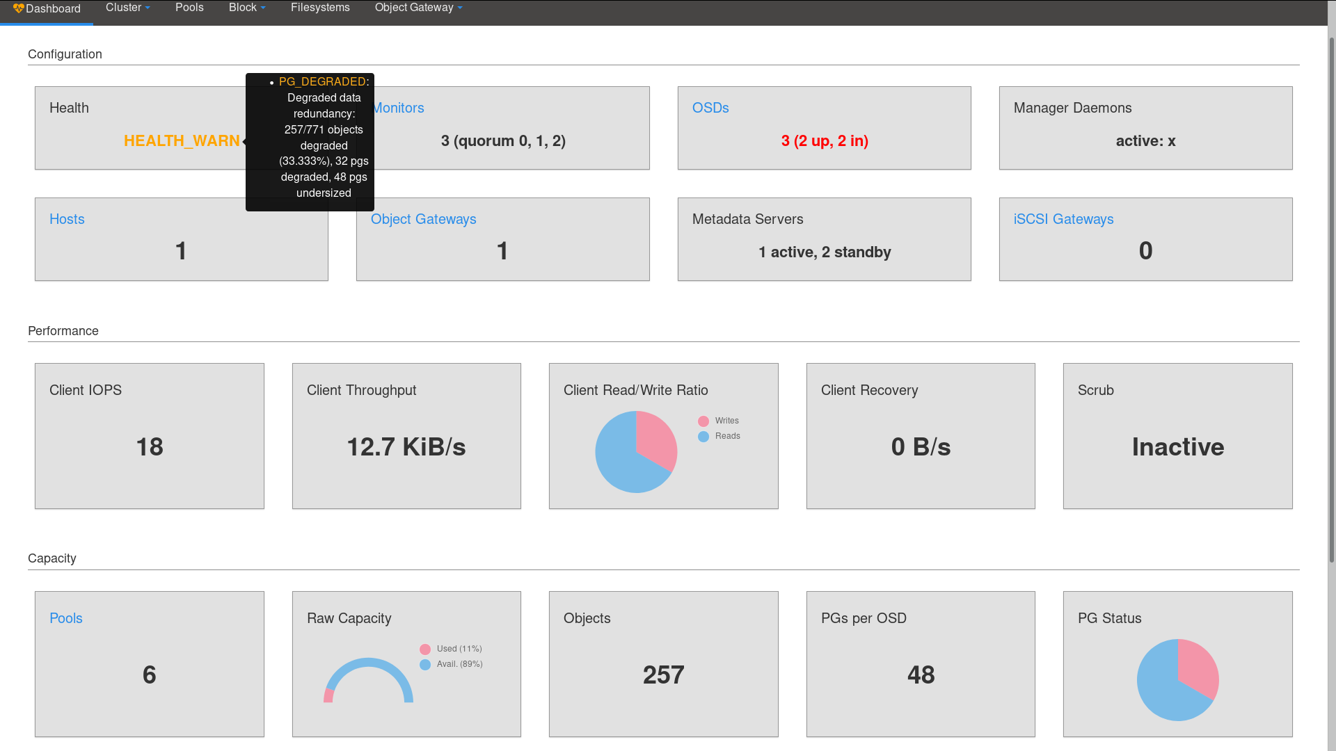
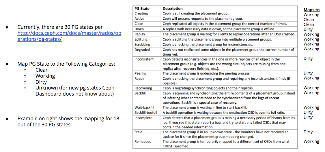
- PG Status — I know there’s an issue about how to show a legend for it. I’d like to propose we change how we show the PG Status. Specifically, I’m taking inspiration from Calamari (the first Ceph console) where they mapped the PG states into 3 different categories: Clean, Working, and Dirty for visualizing them on the Calamari dashboard. We'll also need an Unknown category to handle new PG states that get introduced. The idea behind this is that user really only cares and has to take action on the “Dirty” ones as the Clean and Working ones are automatically handled by Ceph. See attached example ("PG States Mapped to 4 Categories") of what I’m suggesting. It should be noted there exists 30 PG states today, and showing large number of different PG states would be hard in the UI, let alone make it user actionable. My suggestion of 4 categories will make this easier for user to consume the information, but also showing a legend for 4 categories would also help address the legend issue. At some point, if we aggregate this, it would be good to provide a drilldown view of the PG list or PG map, so user can troubleshoot if there are issues.
Thoughts?
Updated by Lenz Grimmer over 5 years ago
Ju Lim wrote:
First-off, I want to say thank you for making progress on the landing page. It’s starting to take shape and is looking better every time I see the changes made.
And thanks to you for the helpful guidance and feedback! I think this is making good progress.
- Heath card: Popover looks good. We still need a way for user to know that this is something the user can mouse-over.
I think it the popover appears when the cursor hovers above the chart immediately, the user will quickly notice it. If it should only appear when clicked, I agree there should be some visual indication (e.g. the mouse cursor icon changes, or the text style changes to underline, to indicate a clickable element?)
- For the Configuration cards (Monitors, OSDs, Manager Daemons, Metadata Servers), color styling the text would be helpful especially when something is down or in a degraded/warning state. I know you mentioned it’s done previously, but do you have an updated example to show when the OSD is down?
Agreed, using color here would be useful.
- Raw capacity card: I know in the original landing page, it had a donut showing the utilization, and now we’re showing a gauge. The gauge seems an unusual choice. Is it possible to go back to the donut or consider a different layout?
Agreed.
- PG Status — I know there’s an issue about how to show a legend for it. I’d like to propose we change how we show the PG Status. Specifically, I’m taking inspiration from Calamari (the first Ceph console) where they mapped the PG states into 3 different categories: Clean, Working, and Dirty for visualizing them on the Calamari dashboard. We'll also need an Unknown category to handle new PG states that get introduced. The idea behind this is that user really only cares and has to take action on the “Dirty” ones as the Clean and Working ones are automatically handled by Ceph. See attached example ("PG States Mapped to 4 Categories") of what I’m suggesting. It should be noted there exists 30 PG states today, and showing large number of different PG states would be hard in the UI, let alone make it user actionable. My suggestion of 4 categories will make this easier for user to consume the information, but also showing a legend for 4 categories would also help address the legend issue. At some point, if we aggregate this, it would be good to provide a drilldown view of the PG list or PG map, so user can troubleshoot if there are issues.
I like the idea of grouping the various PG states into categories, to simplify the PG status widget. I wonder if it would make sense to display the detailed PG state output in a popover then?
Updated by Ju Lim over 5 years ago
- File OSD color styling.png OSD color styling.png added
(1) Regarding the Health Card visual indicator, I'm working some folks to come up with a recommendation (we're trying a few things out first) -- stay tuned.
(2) For the color styling of the Configuration cards, here's an example of what I was thinking of -- see below:
(3) Regarding PG states (sounds like there's agreement to aggregate them to the categories I mentioned). As to how to see PG details, there's not really any good place in the current Dashboard pages to see details for it. So, using a pop-over for now to show the details makes sense and is consistent with what we're doing on the Health Card. I think also linking to see Logs in the pop-over too may make sense as I believe the PG-related entries tend to also show up in the logs. If we plan to show-case PG-related state information on the Pools page (right now I see some reference to it in the current landing page), it may also make sense to link there. Thoughts?
Updated by Alfonso Martínez over 5 years ago
Regarding the PG states, these are the 30 states found in mgr_module.py:
PG_STATES = [
"active",
"clean",
"down",
"recovery_unfound",
"backfill_unfound",
"scrubbing",
"degraded",
"inconsistent",
"peering",
"repair",
"recovering",
"forced_recovery",
"backfill_wait",
"incomplete",
"stale",
"remapped",
"deep",
"backfilling",
"forced_backfill",
"backfill_toofull",
"recovery_wait",
"recovery_toofull",
"undersized",
"activating",
"peered",
"snaptrim",
"snaptrim_wait",
"snaptrim_error",
"creating",
"unknown"]
Classification criteria for chart:
1. If it is found any dirty state => DIRTY.
2. If not, and it is found any unknown state => UNKNOWN.
3. If not, and it is found any working state => WORKING
4. If not all of the above => CLEAN.
All states fall into 4 categories:
- CLEAN (OK states):
active, clean, peered
- WORKING (automatically handled by ceph):
creating, activating, repair, scrubbing, deep, degraded, undersized, recovering, recovery_wait, forced_recovery,
backfilling, backfill_wait, forced_backfill, remapped, snaptrim, snaptrim_wait
- DIRTY (the user has to pay attention because something is wrong):
backfill_toofull, backfill_unfound, recovery_toofull, recovery_unfound, incomplete, stale, snaptrim_error, peering,
inconsistent, down, unknown (see feedback)
- UNKNOWN:
=> states not comprised in the other ones.
¿Is there any mistake in the 4 categories?
Joao feedback:
"unknown" is when ceph does not know the state of the pg
e.g., there is no one tracking that info, or that info has not been communicated by the osd
Updated by Greg Farnum over 5 years ago
What is intended to be meant by “dirty” versus “working”? I’m not sure I understand the classifications here.
Some examples: A PG that is trying to backfill to a new location but is still at its specified pool size might be backfill_toofull, but it’s still properly redundant and serving IO. “Recovery_wait” generally WON’T be serving IO as it’s trying to do log-based recovery and is in a line for some reason.
Also a PG reporting as “peered” generally means it isn’t serving IO for some other reason, but I’m not quite sure the combinations there (it might only show up when in one of the backfill or recovery states).
Updated by Ju Lim over 5 years ago
I've made some changes to the mapping of certain states to the 4 categories (I revised the DIRTY status to WARNING as DIRTY is not really a great label for something that require user attention):
- CLEAN: active, clean
- WORKING: creating, activating, repair, scrubbing, deep, degraded, recovering, recovery_wait, forced_recovery, backfilling, backfill_wait, forced_backfill, snaptrim, snaptrim_wait, peering, peered
- WARNING: backfill_toofull, backfill_unfound, recovery_toofull, recovery_unfound, incomplete, stale, snaptrim_error, inconsistent, down, undersized, remapped
- UNKNOWN: unknown and states not comprised in the other ones.
Note: The "unknown" pg state pertains to when mgr hasn’t yet received any information about the PG’s state from an OSD since mgr started up, and conceivably it should go into "WARNING." The problem is when you see the details, the user will get confused about why there is a "Unknown" category and "unknown" pgstate. If mgr does not know what the pgstate is and calls it unknown, and if there are new states that cannot be mapped and get called unknown, they are fundamentally similar. It boils down to it's unknown and some due diligence is needed on the user's part to determine if action is needed.
Updated by Alfonso Martínez over 5 years ago
Updated by Alfonso Martínez over 5 years ago

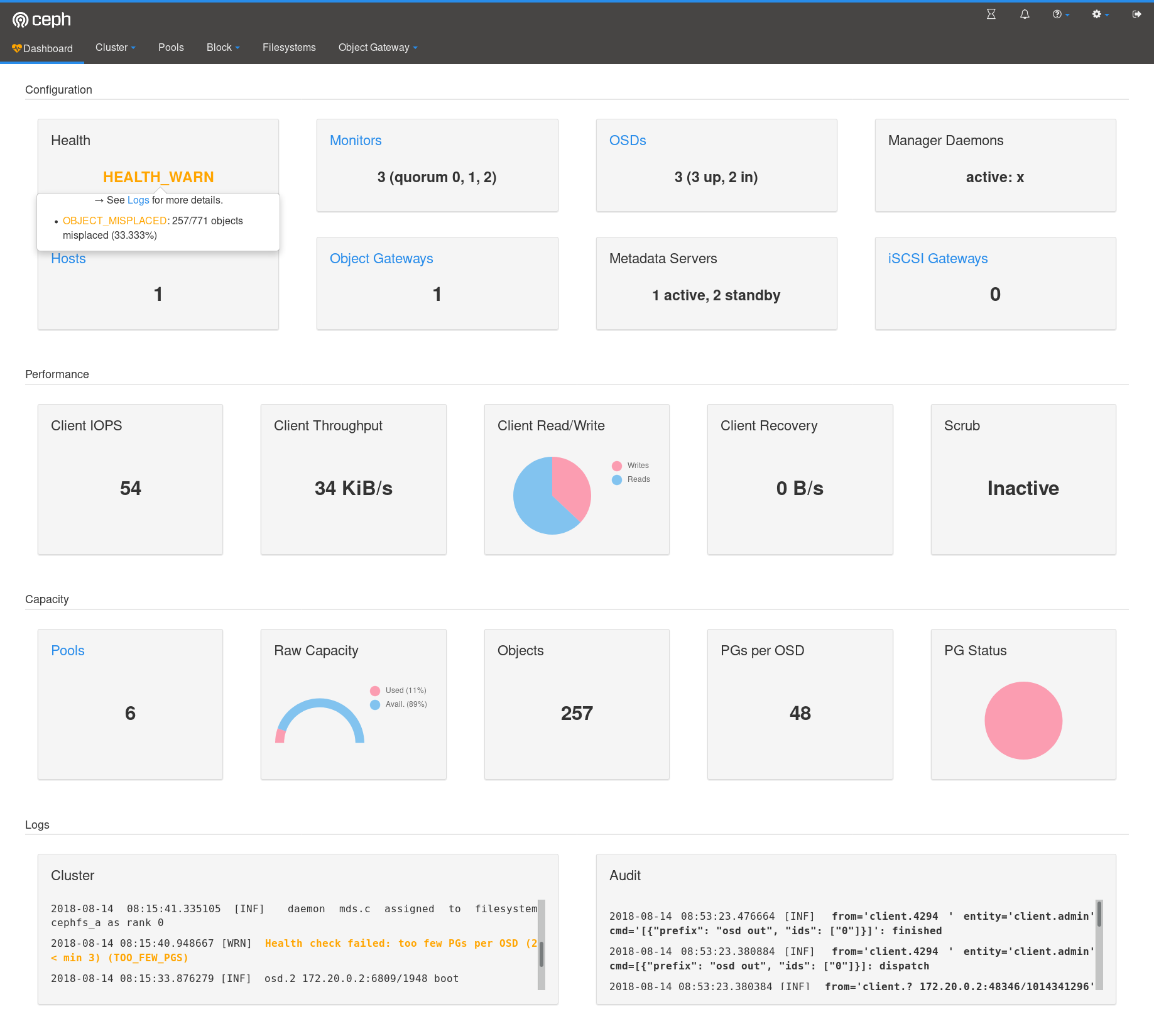
Implemented as requested:
Raw Capacity: doughnut instead of gauge.
PG status card: Legend with 4 categories + popover with original pg info.
OSD card: Only downInfo-related text in red when osd is down.
The mouse changes to a hand (pointer) in Health card and PG Status chart to inform you can click (popover).
Slightly brighter colors for charts (same default colors for all charts).
Updated by Ju Lim over 5 years ago
Can we change the "Error" to "Warning" for the PG Status card? I updated my comments earlier to reflect this but you might have missed that comment.
Updated by Alfonso Martínez over 5 years ago
Ju Lim wrote:
Can we change the "Error" to "Warning" for the PG Status card? I updated my comments earlier to reflect this but you might have missed that comment.
Done.
Updated by Lenz Grimmer over 5 years ago
- Blocks Feature #24571: mgr/dashboard: Move Cluster/Audit logs from front page to dedicated "Logs" page added
Updated by Alfonso Martínez over 5 years ago
Update on PG Status categories from John Spray:
Ceph already internally has an opinion about the health of PGs
(resulting in the PG_DAMAGED, PG_UNAVAILABLE, PG_DEGRADED,
PG_DEGRADED_FULL health checks). You can see where that's done here:
https://github.com/ceph/ceph/blob/master/src/mon/PGMap.cc#L2179
The key point about this is that it's not the status of a PG that
users are really interested in: it's the health of their data (one
difference is that data can't be "working"). So the classifications
we have for the health are:
- Damaged: some (perhaps unrecoverable) data loss has occurred, Ceph
can't fix itself without help
- Degraded: the data is there and accessible, but not as redundant as
we would like
- Unavailable: we can't get at the data right now, but we believe
it's still stored somewhere.
So: if the goal is a simplified way to show PG health in the UI, my
suggestion is not to call it PG health at all, call it "data health"
and use exactly the same mappings that we use for the existing health
checks.
Updated by Ernesto Puerta over 5 years ago
Alfonso MH wrote:
Update on PG Status categories from John Spray:
The key point about this is that it's not the status of a PG that
users are really interested in: it's the health of their data (one
difference is that data can't be "working").
...
So: if the goal is a simplified way to show PG health in the UI, my
suggestion is not to call it PG health at all, call it "data health"
and use exactly the same mappings that we use for the existing health
checks.
That's OK for another chart (data health), but the PG status are still interesting from an operational side as a kind of Ceph HEALTH drill-down.
BTW, I'd move PG status to Configuration (I'd suggest also changing that title to 'Status'). My point here is that PGs are logical elements for Ceph (as Pools or Objects are) with their own status.
Updated by John Spray over 5 years ago
My point here is that PGs are logical elements for Ceph (as Pools or Objects are) with their own status.
They're logical elements internally to Ceph, but they're not meaningful to a human user the way pools, filesystems etc are. Individually manipulating PGs is something that only happens in pretty heavy debugging/repair scenarios. Nobody installs a Ceph cluster because they want placement groups: they're just a means to an end.
Also, once we're doing auto-adjustment of pg_num in Nautilus, the "PGs per OSD" statistic becomes a pretty obscure implementation detail -- might be good to think what else that screen space could be used for once that becomes the case.
tldr: I don't think the new front page should talk about placement groups.
Updated by Ju Lim over 5 years ago
Good points and suggestions from John Spray.
+1 on replacing the "PG Status" panel/widgit with a new one called "Data Health" (like current "Health" card) to show health check values, i.e. DAMAGED, UNAVAILABLE, DEGRADED, or
DEGRADED_FULL. When there's no data health issue, it should say "OK." For the mouseover for the non-OK "Data Health" values, can we show the same mouse-over as we did "PG Status," i.e. the pg state details?
Let's keep this "Data Health" in this "Capacity" section for now (and yes I could agree that it eventually makes sense to move it to the "Configuration" section), but I think it would be good to try and get a first pass of the landing page done with the widgits/panels we have so far.
I like the idea of not talking about PG's in the landing page, but if we would like Dashboard to work on earlier releases, e.g. Luminous, showing "PGs per OSD" will still be needed.
I get that PG's are a means to an end, but operationally even the Ceph admin user still has to understand it to some level to operate and administer Ceph.
On another note, can we switch the "Configuration" label in the top section to "Health" to reduce confusion as there's a "Cluster > Configuration Doc." section in the UI. This means changing also the "Health" card to "Cluster Status."
Updated by Ernesto Puerta over 5 years ago
John Spray wrote:
My point here is that PGs are logical elements for Ceph (as Pools or Objects are) with their own status.
They're logical elements internally to Ceph, but they're not meaningful to a human user the way pools, filesystems etc are. Individually manipulating PGs is something that only happens in pretty heavy debugging/repair scenarios. Nobody installs a Ceph cluster because they want placement groups: they're just a means to an end.
Also, once we're doing auto-adjustment of pg_num in Nautilus, the "PGs per OSD" statistic becomes a pretty obscure implementation detail -- might be good to think what else that screen space could be used for once that becomes the case.
tldr: I don't think the new front page should talk about placement groups.
I agree on that detailed PG information could not be required from the landing page, but IMHO a high level overview to PG status could still be relevant to operators. Most distributed systems haven't managed to hide those internals (partitions/tokens/vnodes/etc.), as they still demand some degree of housekeeping (scrub, repair, reweight, etc) and are commonly a starting point for troubleshooting. Just to name one: Cassandra's UI OpsCenter vnode (PG-like) info.
Nevertheless, I don't want to block this issue any longer, so may we open a separate issue for this topic and try to gather some operator feedback?
Updated by Alfonso Martínez over 5 years ago
Taking into account all the above, this is my proposal:
Apply renaming:- infoGroup "Configuration" => "Health / Status"
- infoCard "Health" => "Cluster Status"
Implement the following in another PR/issue:
- Keep the PG Status chart.
- Replace "PGs per OSD" (whose information can be included in PG Status popover) by
"Data Health" with internal health of PGs as John Spray mentioned.
With this approach we can have both types of information (Data health + PG Status). - Discuss about moving these cards to "Health/Status" group (layout change).
Updated by Lenz Grimmer over 5 years ago
Alfonso MH wrote:
Taking into account all the above, this is my proposal:
Apply renaming:
- infoGroup "Configuration" => "Health / Status"
- infoCard "Health" => "Cluster Status"
Ack, makes sense.
Implement the following in another PR/issue:
- Keep the PG Status chart.
- Replace "PGs per OSD" (whose information can be included in PG Status popover) by
"Data Health" with internal health of PGs as John Spray mentioned.
With this approach we can have both types of information (Data health + PG Status).- Discuss about moving these cards to "Health/Status" group (layout change).
Fine with me as well. Also per our conversation yesterday, let's create a tracker issue that covers the visibility of cards depending on the user's role.
Updated by Ju Lim over 5 years ago
With regards to the "Data Health" card, it looks like we don't have an easy way to get the data at the moment. So, in an effort to move forward the landing page efforts and hopefully get this PR merged soon, can we revert back to the "PG Status" card (chart) for now? Note: For Nautilus, once we have an easy way to get the data, then we can replace it with the "Data Health" card.
Updated by Lenz Grimmer over 5 years ago
Ju Lim wrote:
With regards to the "Data Health" card, it looks like we don't have an easy way to get the data at the moment. So, in an effort to move forward the landing page efforts and hopefully get this PR merged soon, can we revert back to the "PG Status" card (chart) for now? Note: For Nautilus, once we have an easy way to get the data, then we can replace it with the "Data Health" card.
We actually came to a different conclusion on IRC yesterday ;) - here's the log:
<jcsp_> Alfonso: on https://tracker.ceph.com/issues/24573, what would be the difference between the Data health and PG status widgets?  The data health is derived from the PG stats
<jcsp_> the way I'm looking at it, the PG status *is* the data health -- it's just about how we display it
<Lenz> jcsp_: So your proposal would be to *replace* the PG status widget instead of adding a separate one?
<Alfonso> jcsp_: my idea was to display "Data Health" as customer view and "Pg Status" as more "operator" details, but if you think is redundant,
<Alfonso> As I'm about to open a new issue for these kind of improvements, I can reflect this
<epuertat> jcsp_, both charts would be complementary: PG status (with 3-4 aggregate states) is operationally relevant, as long as it depicts performance-impacting conditions (peering, activating, recovering, etc), while Data health is only data consistency meaningful
<jcsp_> It doesn't make sense IMHO to display per-PG status (very low level, technical concept) but squash the states into four categories (simplified, not enough detail for the advanced user)
<jcsp_> showing PG status with full detail is useful (but not a front page thing), and showing data health with the simplified categorisation is useful
<jcsp_> but this business of "PGs but not their actual states" is not so wise
<jcsp_> If you do stick with displaying PGs with simplified states, we need another pass on those states -- it is not good to have a "dirty" category that mixes up seriously damaged PGs (incomplete, inconsistent) with PGs that are just starting up (peering)
<jcsp_> (now that I read further I see that the latest suggestion is to distinguish them between "working" and "warning"... but I still question why invent new categories at all, instead of following what the health checks already do?)
<Alfonso> jcsp_: I understand, so you prefer julim approach of having text instead of chart showing "Damaged" if any pg is in this state, if not showing "Degraded FUll" (if found), "Degraded", "Unavailable" or "Healthy/OK" if all is OK?
<jcsp_> no, I'm not against having a chart.  I just think it should divide the PGs into the same categories that we use for health checks, and that it should be called "data" instead of "PGs"
<epuertat> jcsp_, I think we all agree on having a reduced set of states, the point is to distinguish between a set describing transitional/operation status (reduced performance, reduced availability, capacity headroom) and another describing long-term data health issues
<jcsp_> I'd include availability in the concept of data health.  It's a key indicator of whether the system can do its job (i.e. serve clients).  Example: to call a peering PG "working" is an inwards-looking view (we are doing work) -- to a user, a peering PG is simply unavailable (my OpenStack VMs are frozen).
<Alfonso> jcsp_, epuertat, Lenz, all: Let's go with Data Health chart as John suggests instead of PG Status, and let's discuss the suitability of having PG Info in landing page in another issue
<Lenz> Sounds good to me. Thanks!
<epuertat> jcsp_, Alfonso, that's ok! Let's have that PR ongoing ;-)
<jcsp_> thanks guys -- one more step towards not having to explain PGs to users any more :-)
Updated by Alfonso Martínez over 5 years ago
- Related to Feature #27050: mgr/dashboard: Landing Page Enhancements added
Updated by Alfonso Martínez over 5 years ago
- Related to Feature #27047: mgr/dashboard: Landing Page - Set visibility of cards depending on the user's role added
Updated by Alfonso Martínez over 5 years ago
- Related to Feature #27049: mgr/dashboard: retrieve "Data Health" info from dashboard backend added
Updated by Alfonso Martínez over 5 years ago
Lenz wrote:
We actually came to a different conclusion on IRC yesterday ;) - here's the log:
Lenz, as per our conversation today in daily standup, latest Ju Lim comment is valid.
Here is the related issue: #27049
Updated by Lenz Grimmer over 5 years ago
- Related to Feature #25164: mgr/dashboard: Display basic performance/utilization metrics of a Ceph Pool added
Updated by Lenz Grimmer over 5 years ago
Note that replacing the current landing page means that we will lose the detailed Pools overview that shows the most active pools, their PG status and utilization. I have updated #25164 to keep track of adding this information to the Pools page instead.
Updated by Ricardo Marques over 5 years ago
- Related to Cleanup #35691: mgr/dashboard: Proposed Landing Page added
Updated by Ricardo Marques over 5 years ago
- Status changed from In Progress to Resolved
Updated by Ernesto Puerta about 3 years ago
- Project changed from mgr to Dashboard
- Category changed from 132 to General