Feature #37794
closedmgr/dashboard: CRUSH map viewer RFE
0%
Description
from a UX perspective, I might suggest the following changes:
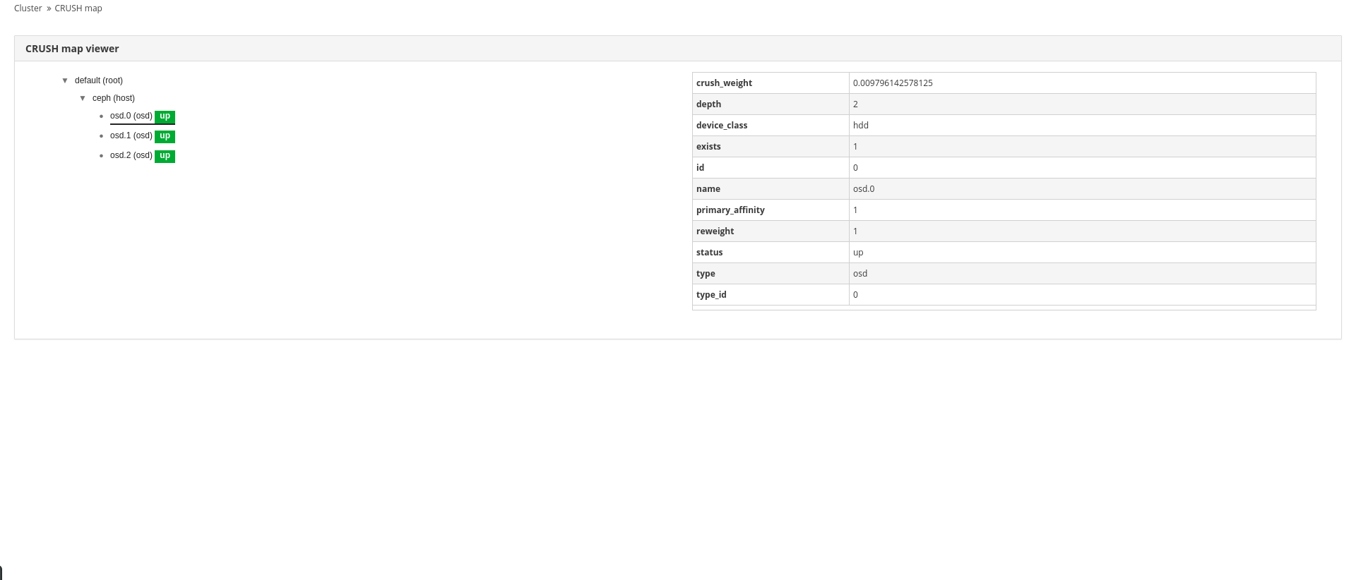
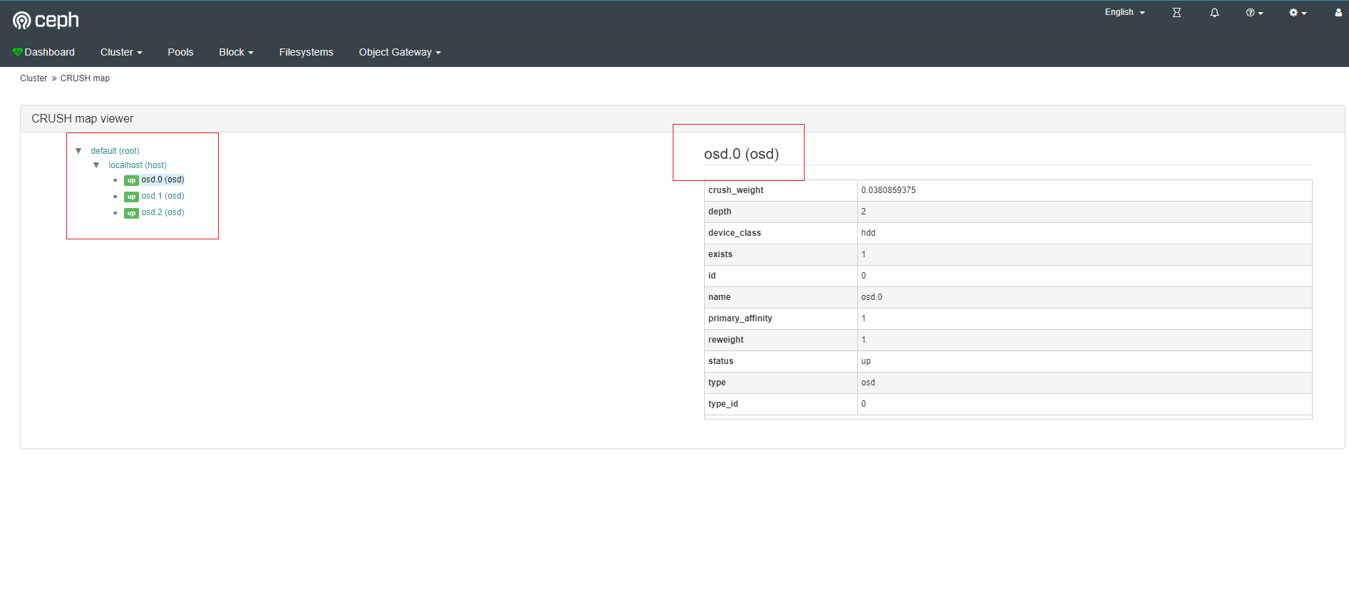
In looking at the recent CRUSH map viewer that has been introduced into Ceph Dashboard (kudos to the team that added the feature), it would be nice to enhance the user experience (UX) of the CRUSH map viewer. The following are some UX suggestions:
- It would be nice if the selection used a cyan/blue selection vs. underline to be consistent with the rest of the application.
- If there are a lot of OSDs in a crush map bucket, e.g. ceph(host) in this example, when user scrolls it will be hard for user to know which crush map bucket the OSD belongs to. It would be good to have some way to outline the selection, i.e. ceph(host) and it's children, when it's expanded to know what's in the bucket itself.
- In the table, it would be nice if the status, e.g. "up" had the same visualization as the tree on the left (to be consistent with other table views showing status).
- In the table on the right, is it possible for the name, id, and type to be higher up in the table? It just seems odd not to see property/config info of the selected item towards the top of the table.
- Are there plans to show the crush rulesets in the future?
Files