Cleanup #39384
closed
mgr/dashboard: Unify the look of dashboard charts
Added by Tiago Melo about 5 years ago.
Updated about 3 years ago.
Description
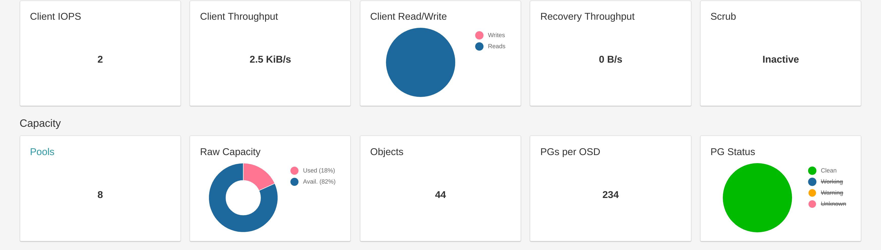
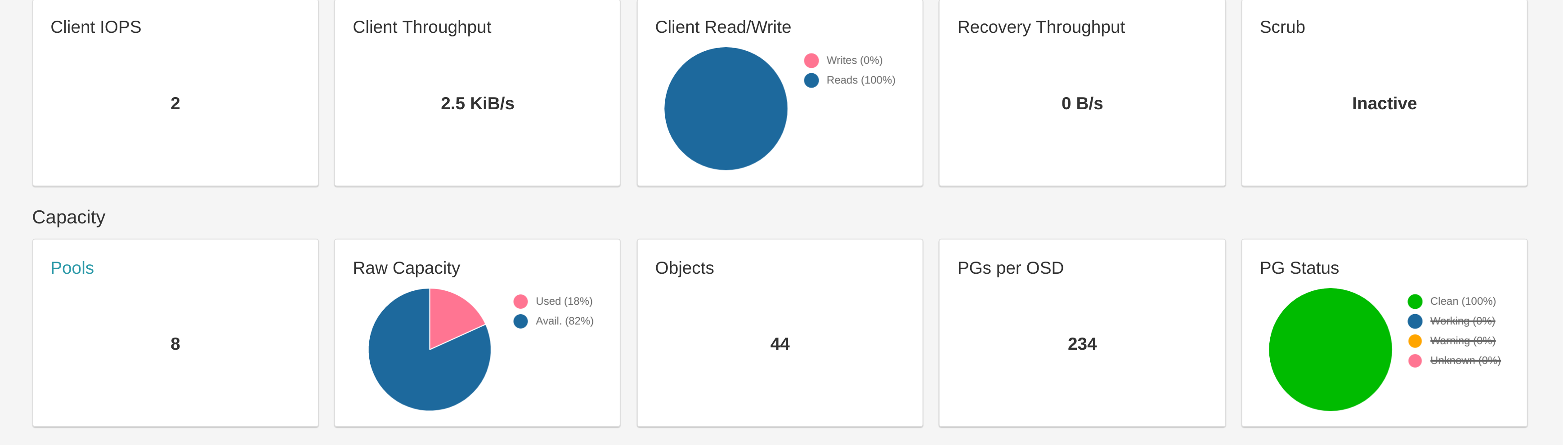
Currently we have 3 charts in the dashboard and each one of them is different.
I would suggest to use pie chart in all and add the % to the labels.
Files
Before:
After:
It can be hard to hover/click in a slice if that slice only has 1%, so the user would only have easy access to the value we display in the label.
Would it make more sense to display the actual value or continue to show the %??
- Related to Feature #38697: mgr/dashboard: Enhance info shown in Landing Page cards 'PGs per OSD' & 'Raw Capacity' added
Tiago Melo wrote:
It can be hard to hover/click in a slice if that slice only has 1%, so the user would only have easy access to the value we display in the label.
Would it make more sense to display the actual value or continue to show the %??
See my comment on #38697 :
With regards to the "Raw Capacity" widget: I have received comments/requests that people would prefer to see the actual numbers in that card's legend instead of having to hover over the widget with the mouse pointer.
I'd suggest to show the percentage if the pointer hovers over the chart and show the actual/real values without requiring any interaction.
- Status changed from Fix Under Review to Pending Backport
- Copied to Backport #39961: nautilus: mgr/dashboard: Unify the look of dashboard charts added
- Target version set to v15.0.0
- Status changed from Pending Backport to Resolved
- Project changed from mgr to Dashboard
Also available in: Atom
PDF