Feature #38697
closedmgr/dashboard: Enhance info shown in Landing Page cards 'PGs per OSD' & 'Raw Capacity'
0%
Description
Currently, the Look'n'Feel of these cards is: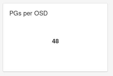
Paul Cuzner enhancement suggestions:
PGs per OSD
Should the title include the word "Average"? This is how the number is calc'd.
Should the value be rounded down or up (50.4 pgs per OSD doesn't make much sense)
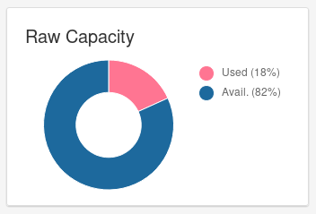
Raw Capacity
Should the tile's title include the used+avail value (i.e. 120TB). At the moment you have to hover and do the math yourself to understand how big your cluster is
Ricardo Dias suggested some time ago to replace the info shown in 'PGs per OSD'
by info showing if distribution of PGs per OSD
is balanced/unbalanced.
Another proposal is to show a range of PGs per OSD:
The OSD with less PGs and the one with max. PGs.
Files
Updated by Sebastian Wagner about 5 years ago
- Subject changed from Enhance info shown in Landing Page cards 'PGs per OSD' & 'Raw Capacity' to mgr/dashboard: Enhance info shown in Landing Page cards 'PGs per OSD' & 'Raw Capacity'
Updated by Ernesto Puerta about 5 years ago
It's a binary one (either Total-Used or Total-Free, the third data is trivial)
These are the related Ceph options:
mon_osd_full_ratio: full ratio of OSDs to be set during initial creation of the clustermon_osd_nearfull_ratio: nearfull ratio for OSDs to be set during initial creation of cluster
- How far is the cluster from running out of space? A donut/pie chart is optimal for this. The color of the chart could go from green to red as it goes beyond near-full ratio.
- How much storage has already been used? Donut/pie.
- The total/used/free bytes.
- How long is going to take for the cluster to become full at the current filling rate (I think this is covered by Grafana dashboard or at least there was some Cephmetrics chart showing this). This is not easy to implement from Ceph-mgr API as we don't have access to time series.
So my suggestion here would be something like this (with absolute figures displayed on tooltips):

Or this:

I think that with PG auto-scaling/shrinking PGs probably are no longer that critical factor (maybe the really relevant data to an operator would be data placement imbalance), but in any case that chart should depict:
- How far are OSDs from the optimal PGs/OSD ratio (100)?
- What are the worst PGs/OSD ratios (lowest-highest)?
- (Optionally) how spread are those ratios (SD, var).
mon_pg_warn_min_per_osd: minimal number PGs per (in) osd before we warn the admin (a HEALTH_WARN is triggered)mon_max_pg_per_osd: max number of PGs per OSD the cluster will allow (a HEALTH_WARN is triggered). Used by pg autoscaling as a high threshold.osd_max_pg_per_osd_hard_ratio: maximum number of PG per OSD, a factor of 'mon_max_pg_per_osd'mon_target_pg_per_osd: Automated PG management creates this many PGs per OSDosd_pool_default_pg_autoscale_mode: Default PG autoscaling behavior for new pools ("off", "warn", "on")
- text-only chart displaying [min, avg, max] and maybe adding colour hints (green if everything is closer to the optimal, red if a threshold is exceeded).
- if we want to go the text-only way: why not looking for single value metric:
rmse = sqrt(sum_i_N((d_i - 100)^2)/N)and map that to OK, WAN, ERR
- if we want to go the text-only way: why not looking for single value metric:
- histogram, perhaps is an overkill, but in the end the flatter the histogram the better balanced the data (so easier to visually understand).
However, my ultimate question on this regard would be: why not showing data imabalance (via ceph df) instead of this/additionally?
Updated by Lenz Grimmer about 5 years ago
- Category set to 152
- Target version set to v14.0.0
Updated by Ju Lim about 5 years ago
+1 on the capacity suggestion from Ernesto.
Regarding the PGs per OSD chart, I know we talked about this needing to get replaced. The intention of the card I think was to express the "Data Health" which the PGs are trying to convey. If I recall, there was some work that was needed in order to even get this information. Should we be considering looking into doing a "Data Health" card instead (as PG's are still somewhat mysterious to a lot of users)?
Updated by Lenz Grimmer about 5 years ago
- Related to Feature #27049: mgr/dashboard: retrieve "Data Health" info from dashboard backend added
Updated by Lenz Grimmer about 5 years ago
Ju Lim wrote:
Regarding the PGs per OSD chart, I know we talked about this needing to get replaced. The intention of the card I think was to express the "Data Health" which the PGs are trying to convey. If I recall, there was some work that was needed in order to even get this information. Should we be considering looking into doing a "Data Health" card instead (as PG's are still somewhat mysterious to a lot of users)?
Looks like we still need the groundwork in the backend to be done for that - see #27049 for details.
Updated by Alfonso Martínez about 5 years ago
Ju Lim wrote:
Regarding the PGs per OSD chart, I know we talked about this needing to get replaced. The intention of the card I think was to express the "Data Health" which the PGs are trying to convey. If I recall, there was some work that was needed in order to even get this information. Should we be considering looking into doing a "Data Health" card instead (as PG's are still somewhat mysterious to a lot of users)?
The card wanted to be replaced was "PG Status" (suggested by John Spray), not "PGs per OSD".
Of course, we can rethink the whole thing and - after deciding what kind of info we want to show -
see if any card is not needed anymore.
Updated by Alfonso Martínez about 5 years ago
- Tracker changed from Fix to Feature
- Assignee deleted (
Alfonso Martínez)
Updated by Alfonso Martínez about 5 years ago
- Related to Cleanup #39384: mgr/dashboard: Unify the look of dashboard charts added
Updated by Lenz Grimmer about 5 years ago
With regards to the "Raw Capacity" widget: I have received comments/requests that people would prefer to see the actual numbers in that card's legend instead of having to hover over the widget with the mouse pointer. This sounds like a fairly straightforward/simple fix that could probably be addressed in a subtask of this issue.
Updated by Lenz Grimmer about 5 years ago
- Translation missing: en.field_tag_list set to usability, monitoring
- Target version changed from v14.0.0 to v15.0.0
Updated by Stephan Müller over 3 years ago
- Related to Bug #40203: ceph df shows incorrect usage added
Updated by Stephan Müller over 3 years ago
- Related to Bug #41829: ceph df reports incorrect pool usage added
Updated by Lenz Grimmer over 3 years ago
Lenz Grimmer wrote:
With regards to the "Raw Capacity" widget: I have received comments/requests that people would prefer to see the actual numbers in that card's legend instead of having to hover over the widget with the mouse pointer. This sounds like a fairly straightforward/simple fix that could probably be addressed in a subtask of this issue.
Looks like this part was partially addressed in this pull request already: mgr/dashboard: Landing Page improvements
Updated by Lenz Grimmer over 3 years ago
- Related to Cleanup #42072: mgr/dashboard: landing page 2.0 added
Updated by Ernesto Puerta over 3 years ago
- Status changed from New to Closed
Already fixed by latest landing page improvements.
Updated by Ernesto Puerta about 3 years ago
- Project changed from mgr to Dashboard
- Category changed from 165 to UI