Cleanup #35692
closedCleanup #35688: mgr/dashboard: Community branding & styling recommendations
Proposed background color
0%
Description
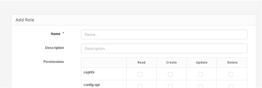
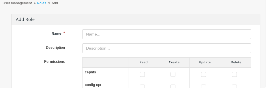
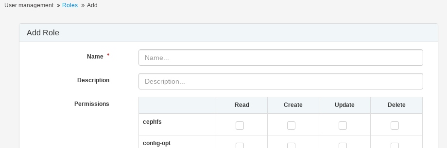
- Example of how one of the other pages will look with the new background brand gray (#F5F5F5)
- All other pages would need to be updated with the same background brand gray (#F5F5F5) for consistent look and feel

Files
Updated by Ernesto Puerta over 5 years ago
- File gray_background.png added
- Copied from Cleanup #35691: mgr/dashboard: Proposed Landing Page added
Updated by Ernesto Puerta over 5 years ago
- Copied to Cleanup #35693: Proposed About modal box added
Updated by Ricardo Marques over 5 years ago
- File 2018-09-05_14-20-33.png 2018-09-05_14-20-33.png added
- File 2018-09-05_14-19-57.png 2018-09-05_14-19-57.png added
`#F5F5F5` color is currently used on panel headers, table headers, etc..:

After changing the background color to `#F5F5F5`, shouldn't we consider choosing a different color for panel headers, table headers, etc..?
For instance, `#F2F6F8`:
Updated by Volker Theile over 5 years ago
Please don't use #F2F6F8, it gives the UI an ExtJS default theme look.
Updated by Ernesto Puerta over 5 years ago
- File ceph_mast_pre_fix.png ceph_mast_pre_fix.png added
- Description updated (diff)
Updated by Michael Celedonia over 5 years ago
- File Screen Shot 2018-09-05 at 11.35.25 AM.png Screen Shot 2018-09-05 at 11.35.25 AM.png added
- File Screen Shot 2018-09-05 at 11.35.36 AM.png Screen Shot 2018-09-05 at 11.35.36 AM.png added
I will propose a color between #F5F5F5 and #FFFFFF, it's a subtle off-white but it still makes a difference, #FCFCFC. The other option is to go a shade darker than the BG, which I would recommend against as it provides less context for the label text above and feels to compete more with the background visually. But if you prefer that option, I could recommend #F2F2F2.
Screenshots of each below, try it in the browser as well if possible.
Updated by Michael Celedonia over 5 years ago
Michael Celedonia wrote:
I will propose a color between #F5F5F5 and #FFFFFF, it's a subtle off-white but it still makes a difference, #FCFCFC. The other option is to go a shade darker than the BG, which I would recommend against as it provides less context for the label text above and feels to compete more with the background visually. But if you prefer that option, I could recommend #F2F2F2.
Screenshots of each below, try it in the browser as well if possible.
#FCFCFC
#F2F2F2
Updated by Ricardo Marques over 5 years ago
Michael Celedonia wrote:
I will propose a color between #F5F5F5 and #FFFFFF, it's a subtle off-white but it still makes a difference, #FCFCFC. The other option is to go a shade darker than the BG, which I would recommend against as it provides less context for the label text above and feels to compete more with the background visually. But if you prefer that option, I could recommend #F2F2F2.
Screenshots of each below, try it in the browser as well if possible.
`FCFCFC` looks great, thanks :)
Updated by Lenz Grimmer over 5 years ago
- Target version set to v14.0.0
- Tags changed from UI to UI, low-hanging-fruit
Updated by Neha . over 5 years ago
- Status changed from In Progress to Fix Under Review
Updated by Yaniv Kaul over 5 years ago
Are the color compliant with any standard that'll help users with color blindness?
See https://usabilla.com/blog/how-to-design-for-color-blindness/
Updated by Lenz Grimmer over 5 years ago
Yaniv Kaul wrote:
Are the color compliant with any standard that'll help users with color blindness?
See https://usabilla.com/blog/how-to-design-for-color-blindness/
Please see the comments in #35691 for a discussion about this topic - I'll look into submitting a dedicated tracker issue to keep this on our radar.
Updated by Lenz Grimmer over 5 years ago
Updated by Lenz Grimmer over 5 years ago
- Related to Feature #37981: mgr/dashboard: Improve dashboard usability for visually impaired users added
Updated by Ricardo Marques over 5 years ago
- Status changed from Fix Under Review to Won't Fix