Tasks #58009
closedFeature #57861: mgr/dashboard: Dashboard landing page revamp
mgr/dashboard: style cards on the page
0%
Description
Description
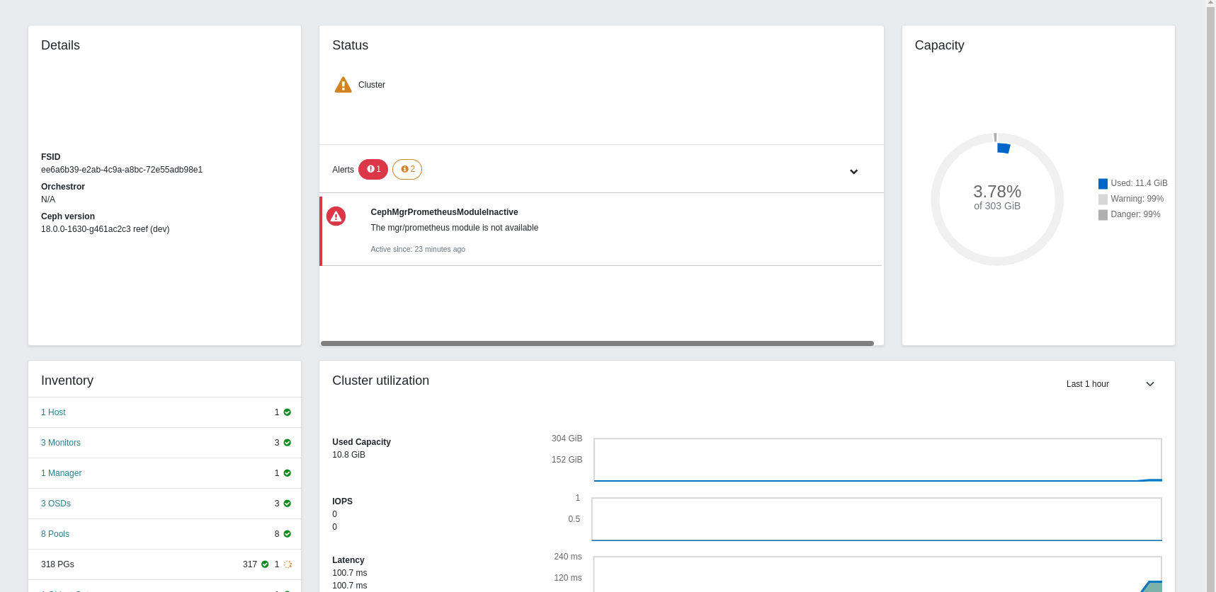
Currently on the dashboard revamp we are placing the cards within a Bootstrap grid of two rows with three and two coloumns respectively, to fit the grid some cards take extra space than their content which makes the page to look somewhat empty (we already have gotten feedback about that), so following our innitial planinng.
We should make the cards fit the available space better, and profit from the available space trying to avoid white spaces (whiout displaying unnecessary information)
Current view:
Marked with red squares the empty spaces that the content should fit better.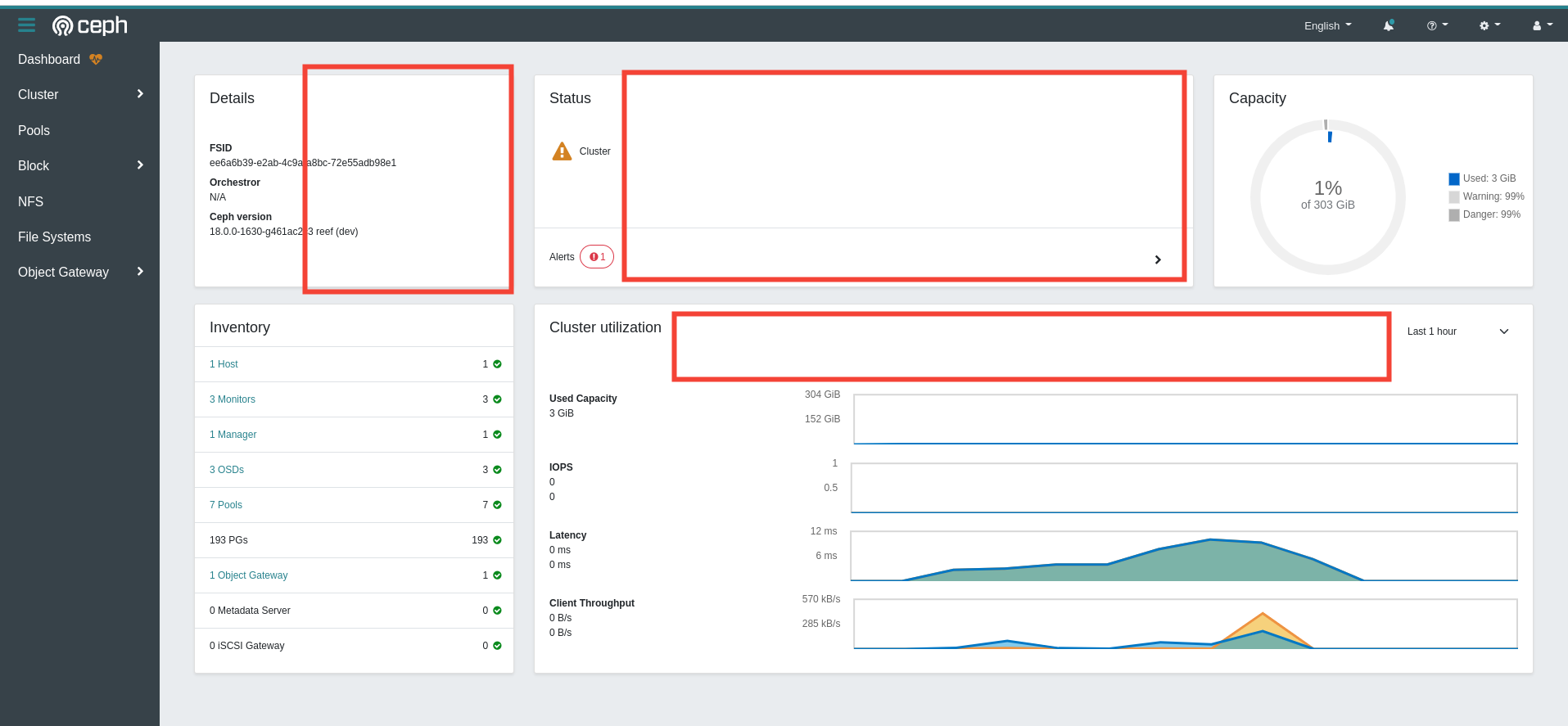
Also, when opening the status card dropdown to show the alerts, avoid moving the other cards on the row
Files
Updated by Pedro González Gómez over 1 year ago
- File sintitulo.png sintitulo.png added
- Description updated (diff)
Updated by Pedro González Gómez over 1 year ago
- File b09fa7ef45eba360336621921f51b8f8.png b09fa7ef45eba360336621921f51b8f8.png added
- Description updated (diff)
Updated by Pedro González Gómez about 1 year ago
- Status changed from New to Resolved
Updated by Pedro González Gómez about 1 year ago
- Status changed from Resolved to Closed
Updated by Nizamudeen A about 1 year ago
- Tracker changed from Feature to Tasks
- Status changed from Closed to Resolved