Cleanup #42307
openCleanup #42304: mgr/dashboard: alerts and silences pages improvements
mgr/dashboard: editing silence: symbols for matchers are obscure
0%
Description
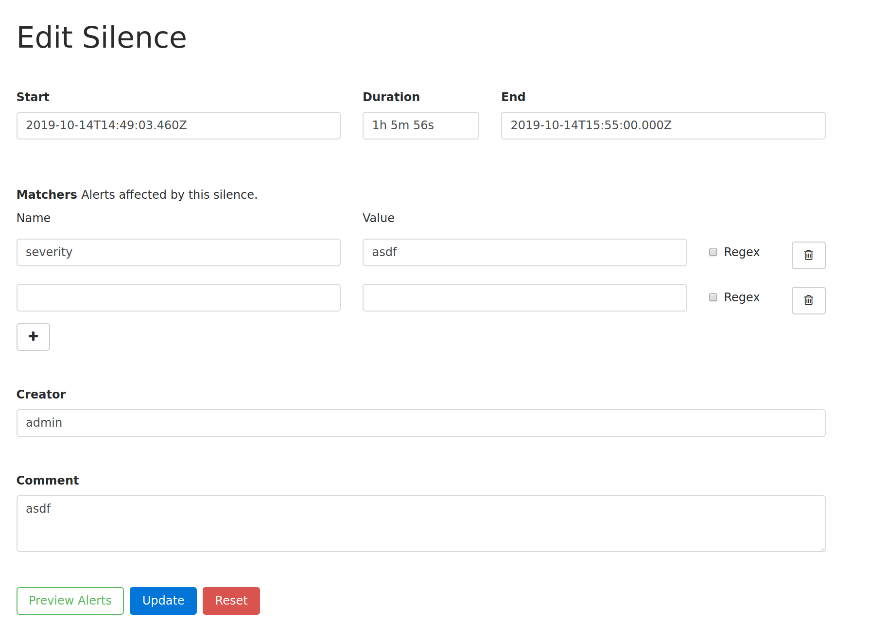
The chosen icons for the matchers than can be defined to create a silence are rather obscure. The pilcrow (¶) symbol is used for the name of the matcher and the `>_` is used to describe the value of a matcher. A wand is used as a symbol for a regular expression. The checkbox right of the wand indiciates if it's a regular expression.
![]()
The alertmanager uses a column text to describe those fields, which I personally find much cleaner and less obscure.
![]()
But to be consistent with the rest of the dashboard, it might make sense to convert this into a table.
Files
Updated by Lenz Grimmer over 4 years ago
- Translation missing: en.field_tag_list set to usability
- Tags deleted (
usability)
Updated by Stephan Müller almost 4 years ago
All icons have tool tips that describe their purpose. Also we don't have suche listings in forms - we only have similar things to the current one, found for example in the RGW forms.
We also shouldn't try to mimic the form as it is in the altermanger, as already described in another issue (#42305).
IMO there is no need for a change here as the current approach looks much better and provides a lot more features than the alertmanger does through its separate matcher modal form.
Updated by Lenz Grimmer almost 4 years ago
I have to agree with Patrick here. Even though these icons may have tooltips, their meaning is not immediately clear and could be confusing. I'd also be in favor of a more descriptive approach here.
Updated by Stephan Müller almost 4 years ago
Here a screenshot how it looks in the RGW form 
Please keep in mind that our forms are not stretched to 100% like in the Alertmanger.
I also tried it before and it really didn't look that good as the form was not big enough and it was hard to determine which matcher input belongs to witch matcher.
In order to comparison I compared two silences in the dashboard and the alertmanger at a display size of 1920x1080.
 vs
vs 