Feature #37402
closedmgr/dashboard: Merge Background task list and alerts/notifications into a single "Events" lists
0%
Description
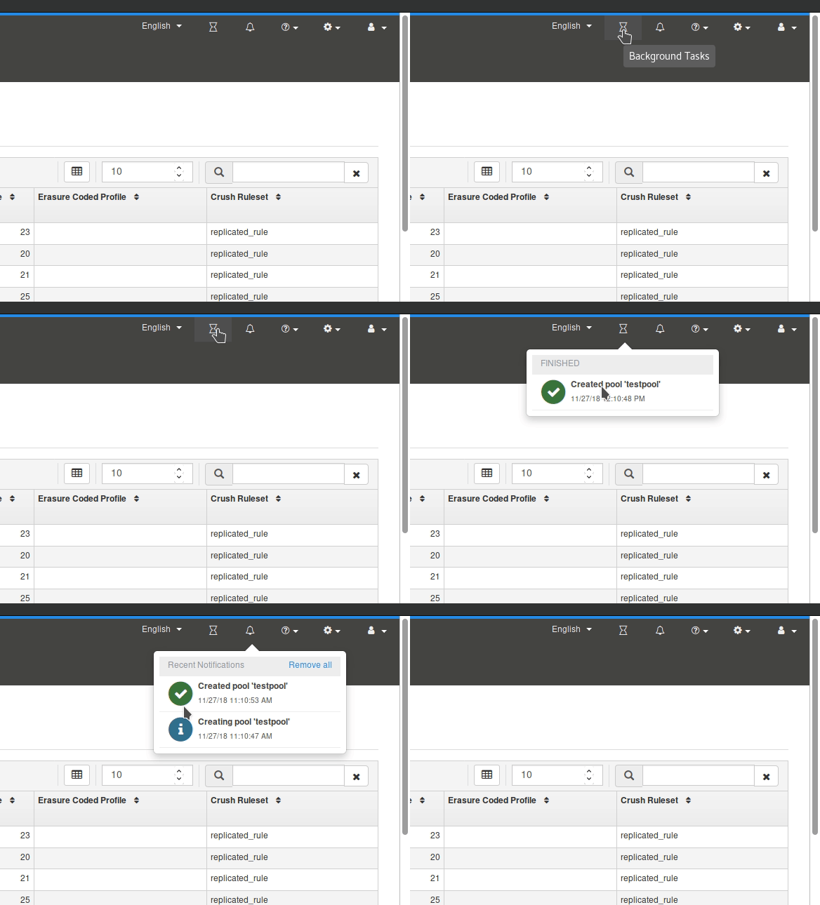
Currently, we have two separate views for informing the user for ongoing activities and noteworthy events. This causes some duplication of information, e.g. for finished background tasks that are displayed in both lists:

Wouldn't it be better to merge these into a single "Events" list?
Files
Updated by Tiago Melo almost 5 years ago
We should convert the popup into a notification sidebar. Like Trello does.
Updated by Tiago Melo over 4 years ago
- Status changed from New to In Progress
- Assignee set to Tiago Melo
Updated by Tiago Melo over 4 years ago
- File notifications.png notifications.png added
Updated by Tiago Melo over 4 years ago
- Should we change the color of the icon when there are notification? Only when there are running tasks?
- Should we show the number of notifications in the icon? Only when there are running tasks?
- Title should be "Recent notifications" or simply "Notifications"?
- Is the position of the remove button OK?
- What should be the text of the remove button? "Remove all bellow", "Remove finished", "Remove all"
- Should we save the start updating notification or just the finished notification?

Updated by Tiago Melo over 4 years ago
- Status changed from In Progress to Fix Under Review
- Pull request ID set to 29706
Updated by Patrick Seidensal over 4 years ago
Tiago Melo wrote:
Few questions regarding this implementation:
1. Should we change the color of the icon when there are notification? Only when there are running tasks?
2. Should we show the number of notifications in the icon? Only when there are running tasks?
I don't know much about tasks and notifications, so please bear with me.
I think the notifications for short running tasks like `Pool created/delete/edited` (exceptions excluded) and similar are not worth being highlighted. Those are actions that the user has initiated and should know of and not be motivated to click and review them, unless it was a long running task. It would be odd for me to be notified about a change I have initiated that completed nearly instantly.
or
If notifications of other users are shown, too, then it might make sense to use three colors:
- color x on notifications
- color y on running tasks
- color z when there are notifications and running tasks
or (the IMO better alternative to three colors)
If we show the amount of notifications or running tasks in a counter (like possible in Bootstrap Badges) it might not make sense to change the color of the icon at all. A counter would be sufficient and different counters could have different colors. Counters have the additional benefit that users would instantly see more details without having to click anything. One can see how many unread notifications there are, if any as well as how many running tasks there are, if any (provided both counters have different colors and the user has gotten used to them).
3. Title should be "Recent notifications" or simply "Notifications"?
I favor "Notifications". As they than can be read at any time, they might not even be "recent" anymore.
4. Is the position of the remove button OK?
Yes, for me it is.
5. What should be the text of the remove button? "Remove all bellow", "Remove finished", "Remove all"
I like text current text "Remove all". It should not be able to remove running tasks, just notifications and "all" is very clear to me what is going to happen. Additionally, there's this gap between running tasks and notifications which makes is even more clear what is meant here. By the way, I like that I can click "Remove all" without having to move the mouse to the bottom of the notifications!
6. Should we save the start updating notification or just the finished notification?
My initial reaction to this was "just the finished" notifications, but for long running tasks, one might want to know when they have been started, so that the duration of the tasks can be determined. If the duration (and may also the starting time) is contained in the "finished notifications", I don't see a reason to have the "starting" and "updating" notifications logged anymore.
Updated by Lenz Grimmer over 4 years ago
Tiago Melo wrote:
Few questions regarding this implementation:
- Should we change the color of the icon when there are notification? Only when there are running tasks?
- Should we show the number of notifications in the icon? Only when there are running tasks?
Per our direct discussion, we concluded that showing a message count or changing the icon color might not be feasible, as we can't distinguish between "unread/new" and "read" notifications.
- Title should be "Recent notifications" or simply "Notifications"?
Simply "Notifications" should be fine IMHO.
- Is the position of the remove button OK?
Fine with me.
- What should be the text of the remove button? "Remove all bellow", "Remove finished", "Remove all"
How about "Clear"?
- Should we save the start updating notification or just the finished notification?
Not sure what you mean by this - can you elaborate?
Updated by Lenz Grimmer over 4 years ago
- Status changed from Fix Under Review to Resolved
- Target version set to v15.0.0
Updated by Nathan Cutler about 4 years ago
Backporting note: This is being backported to nautilus via #42877
Updated by Ernesto Puerta about 3 years ago
- Project changed from mgr to Dashboard
- Category changed from 132 to General