Feature #27218
closedmgr/dashboard: Style guide to give a the UI an overall look and feel
0%
Description
Currently there is a wild mix of workflows spread across the whole UI how things, e.g. invalid form field input or successful actions, are handled.
For example the 'Block> Images > Add RBD' dialog does not check if the entered name already exists while typing it. This shouldn't be a problem nowadays. If you enter an already used name and press 'Create RBD', the error message, that the name already exists, is displayed as notification. IMHO such messages shouldn't displayed via notification, instead they should be displayed in the form. As a user i expect that the 'Name' input field is now marked as red and a meaningful info message like 'Name is already used' is shown below the invalid form field.
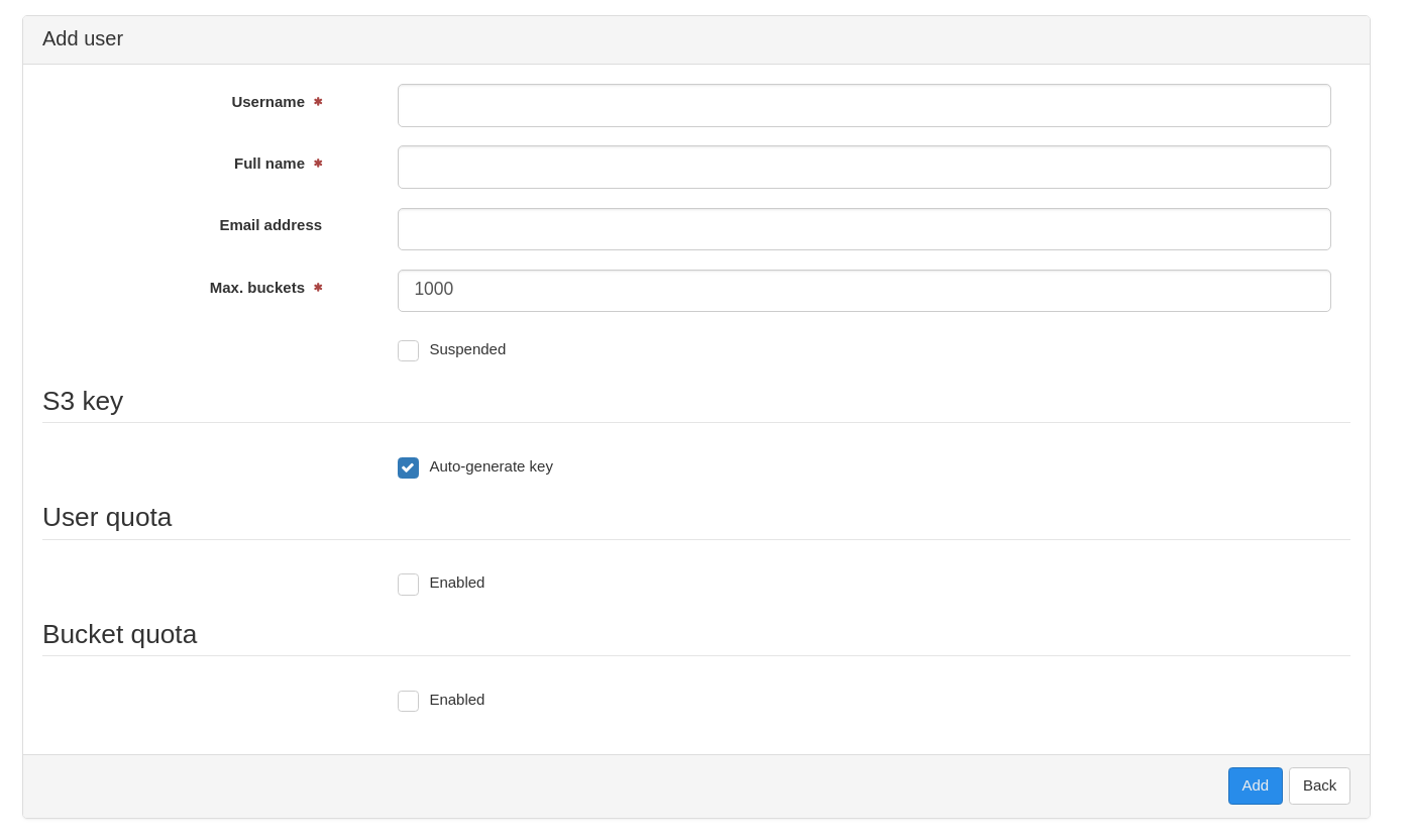
The 'Object Gateway > Users > Add' form is an example how it should be done.
Some dialogs display a notification on successful actions. IMHO notifications are only useful for erroneous actions. The user realizes a successful action via the UI activity, e.g. after a RBD image is successfully created the list view is displayed afterwards. On error, the add dialog is still shown.
Topics to be discussed for a style guide to give a the UI an overall look and feel:
- Mark invalid form fields as red and show a meaningful error message
- Do NOT use notifications for form validation messages
- Use async validation during typing wherever possible
- Do NOT use notifications on successful actions
- Define how to type menu entries and breadcumbs (Every word starts in uppercase or only the first one, e.g. 'User Management' vs. 'User management').
- Use read-only inputs fields in forms to display not editable text.
- ...
Files
Updated by Volker Theile over 5 years ago
- Subject changed from mgr/dashboard: UI style guide how to handle invalid form input to mgr/dashboard: Style guide to give a the UI an overall look and feel
- Description updated (diff)
Updated by Patrick Seidensal over 5 years ago
Volker Theile wrote:
- Mark invalid form fields as red and show a meaningful error message
- Do NOT use notifications for form validation messages
- Use async validation during typing wherever possible
- Do NOT use notifications on successful actions
- ...
I agree with all those points but also think, as you do, that, for some form elements, it's not possible to validate on every keystroke simply because of the time it'd take or the load it'd produce.
+1
Updated by Lenz Grimmer over 5 years ago
- Related to Documentation #24210: mgr/dashboard: Implement and document UX design workflow and guidelines added
Updated by Stephan Müller over 5 years ago
I would suggest to add a list of components that should be used if possible.
As this topic has the potential to raise a lot of bike-shed painting discussions, it makes sense to schedule a meeting to evaluate all needed things in an ehterpad first and than add the outcome to this, to this tracker issue or just link the etherpad
Updated by Patrick Seidensal over 5 years ago
I was just asked to use the WarningPanelComponent for error messages to reuse components which are already there and to be consistent accros the UI. I think it's worth noting it in the style guide, too.
Updated by Patrick Seidensal over 5 years ago
Although specifically created for SUSE, it might make sense to adopt the Writing Guides in the UI wherever text is presented to the user. There's also a similar Writing Guide from RedHat. Discussing the writing style seems to be worth of having a separate discussion about it, as it could be rather comprehensive and time consuming. It could also make sense to cherry pick from both worlds.
Updated by Ernesto Puerta over 5 years ago
- Related to Cleanup #35688: mgr/dashboard: Community branding & styling recommendations added
Updated by Patrick Seidensal over 5 years ago
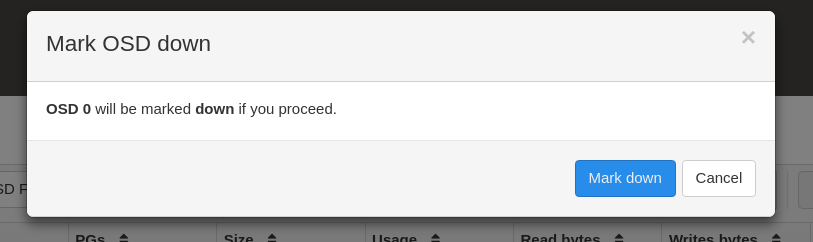
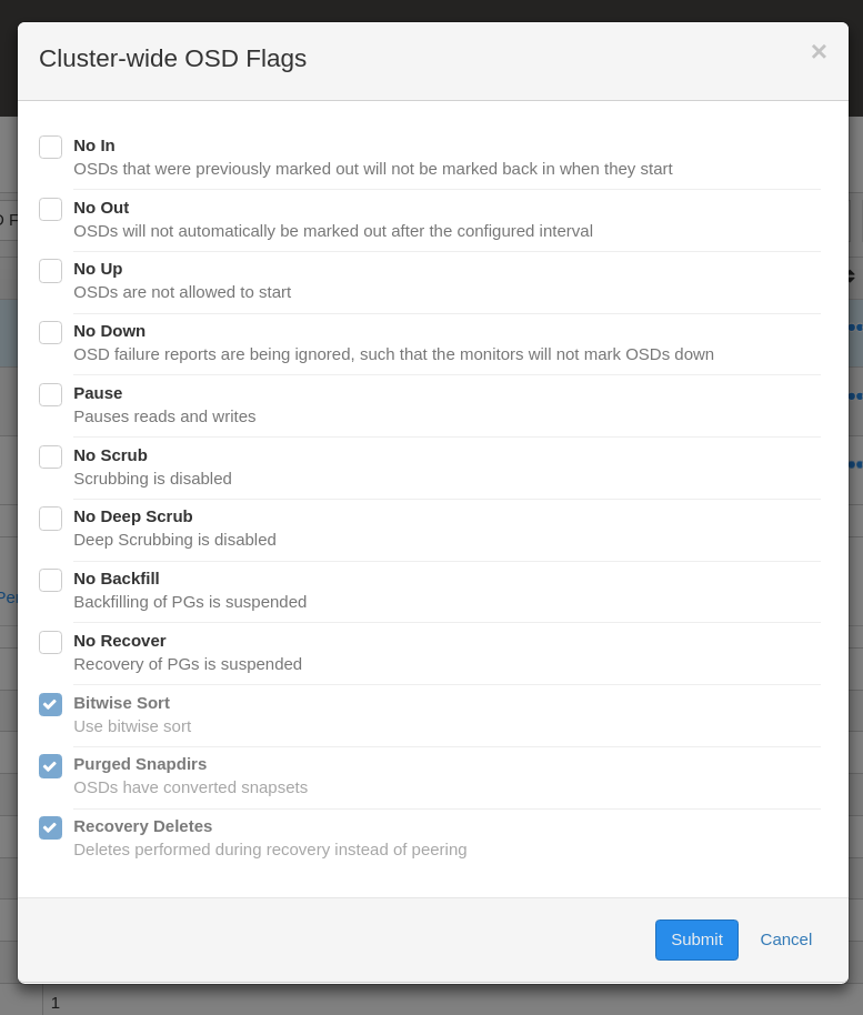
We use different buttons to cancel a dialog/wizard. One type of button looks just like a link, the other is a white button. And one time there's a back button instead of a cancel button. Sometimes it's a modal dialog, sometimes the dialog is embedded in the page. I don't have a strong opinion on any of these but we should stick to one type of button and dialog.
Some examples:
edit:
There seems to be consistency with adding/creating something. These forms are always embedded.
Updated by Patrick Seidensal over 5 years ago
- File add-user-embedded.png add-user-embedded.png added
- File confirmation-dialog.png confirmation-dialog.png added
- File custom-dialog-osd-flags.png custom-dialog-osd-flags.png added
Updated by Lenz Grimmer over 5 years ago
- Related to Cleanup #36070: mgr/dashboard: Use a unified quoting style (double quotes) across all UI elements (e.g. notifications) added
Updated by Lenz Grimmer about 5 years ago
- Related to Cleanup #33606: mgr/dashboard: Use ModalComponent in all modals added
Updated by Lenz Grimmer about 5 years ago
- Related to Bug #34312: mgr/dashboard: Style guide for frontend/Angular coding conventions added
Updated by Lenz Grimmer about 5 years ago
- Related to Feature #36607: mgr/dashboard: Display description on mouse hover added
Updated by Bhaskar Aditya about 4 years ago
Hi, My name is Bhaskar, a GSoC applicant, I have submitted my draft proposal on the project idea CEPH dashboard UI enhancements and this is one of the issues under it.
Can you suggest any starting point for this issue??
Updated by Lenz Grimmer over 3 years ago
- Translation missing: en.field_tag_list set to documentation
- Assignee set to Ishan Rai
Updated by Lenz Grimmer over 3 years ago
- Status changed from New to Resolved
- Target version set to v16.0.0
Updated by Ernesto Puerta about 3 years ago
- Project changed from mgr to Dashboard
- Category changed from 132 to General